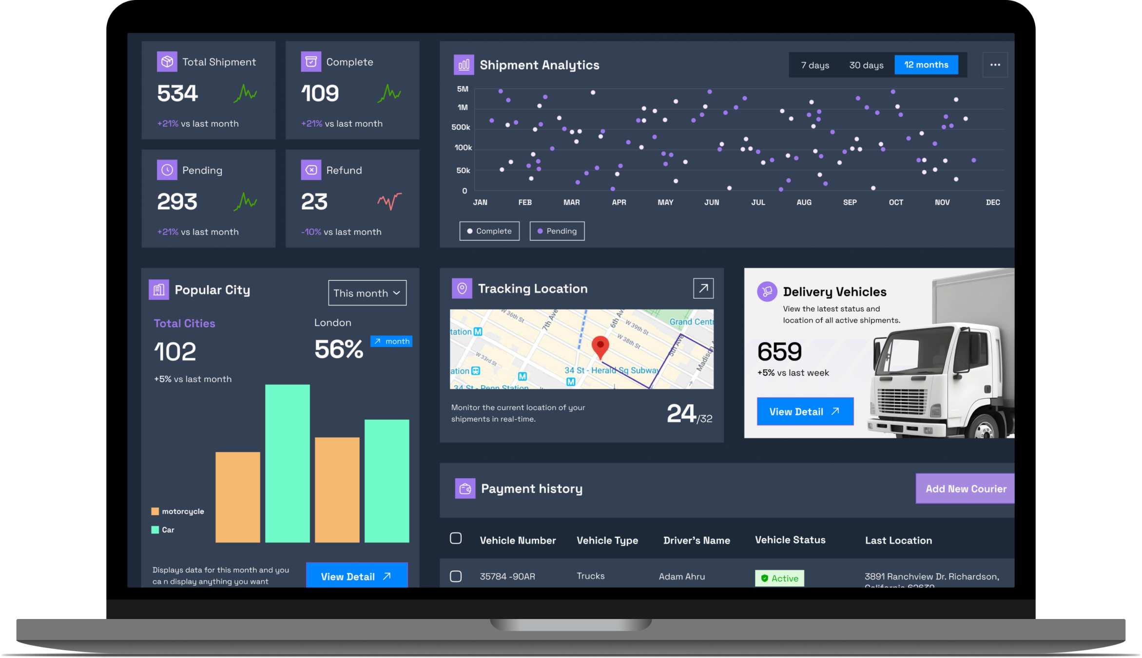
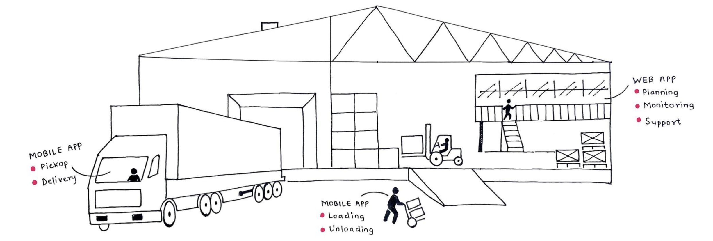
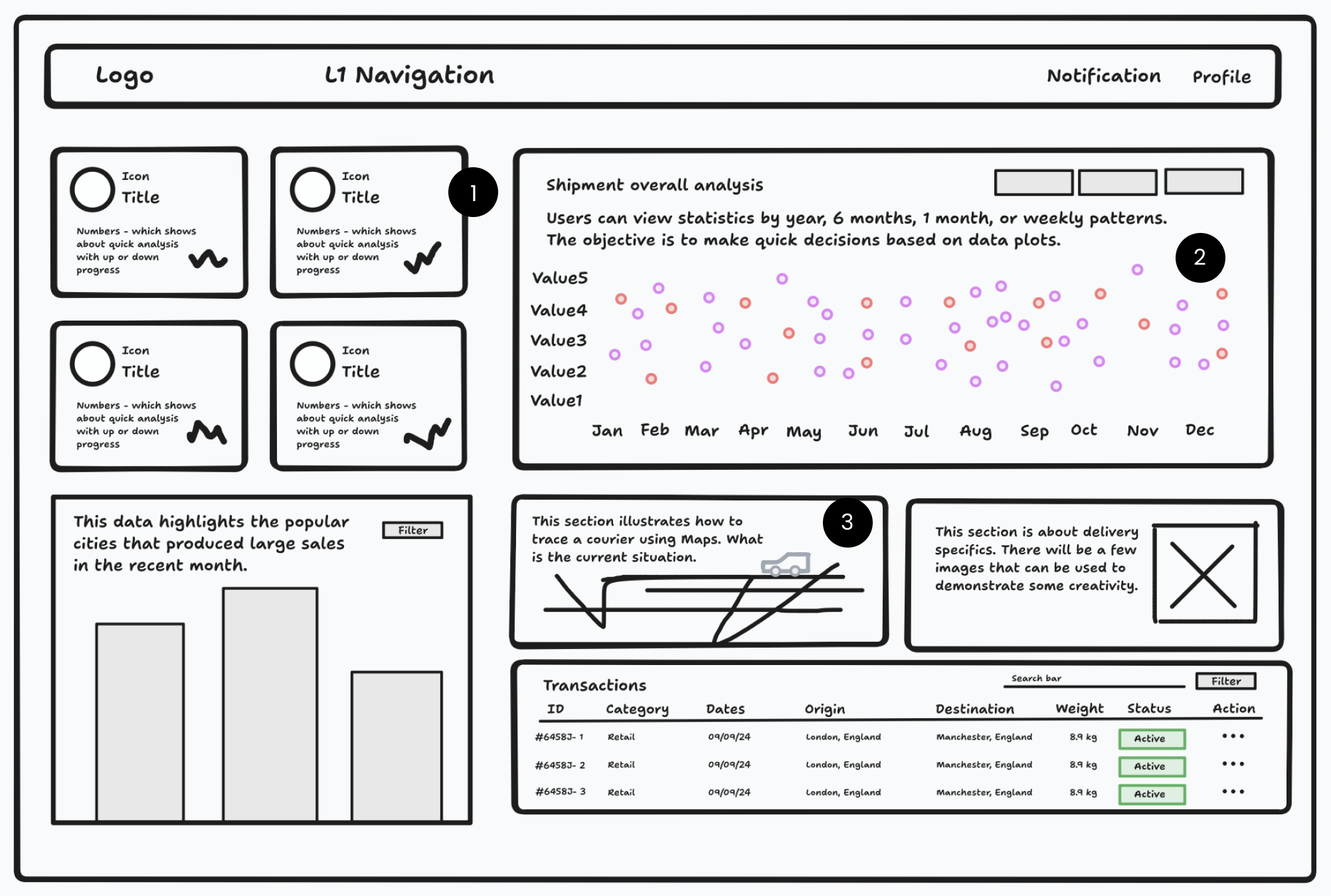
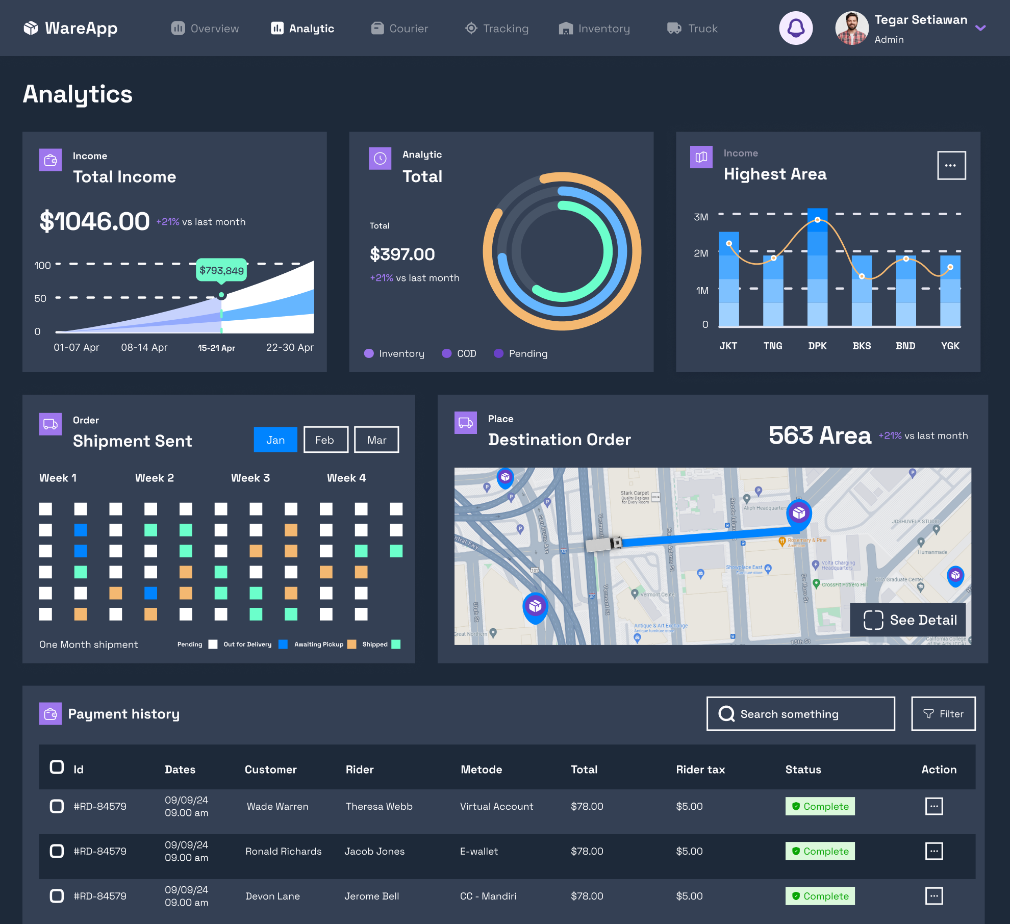
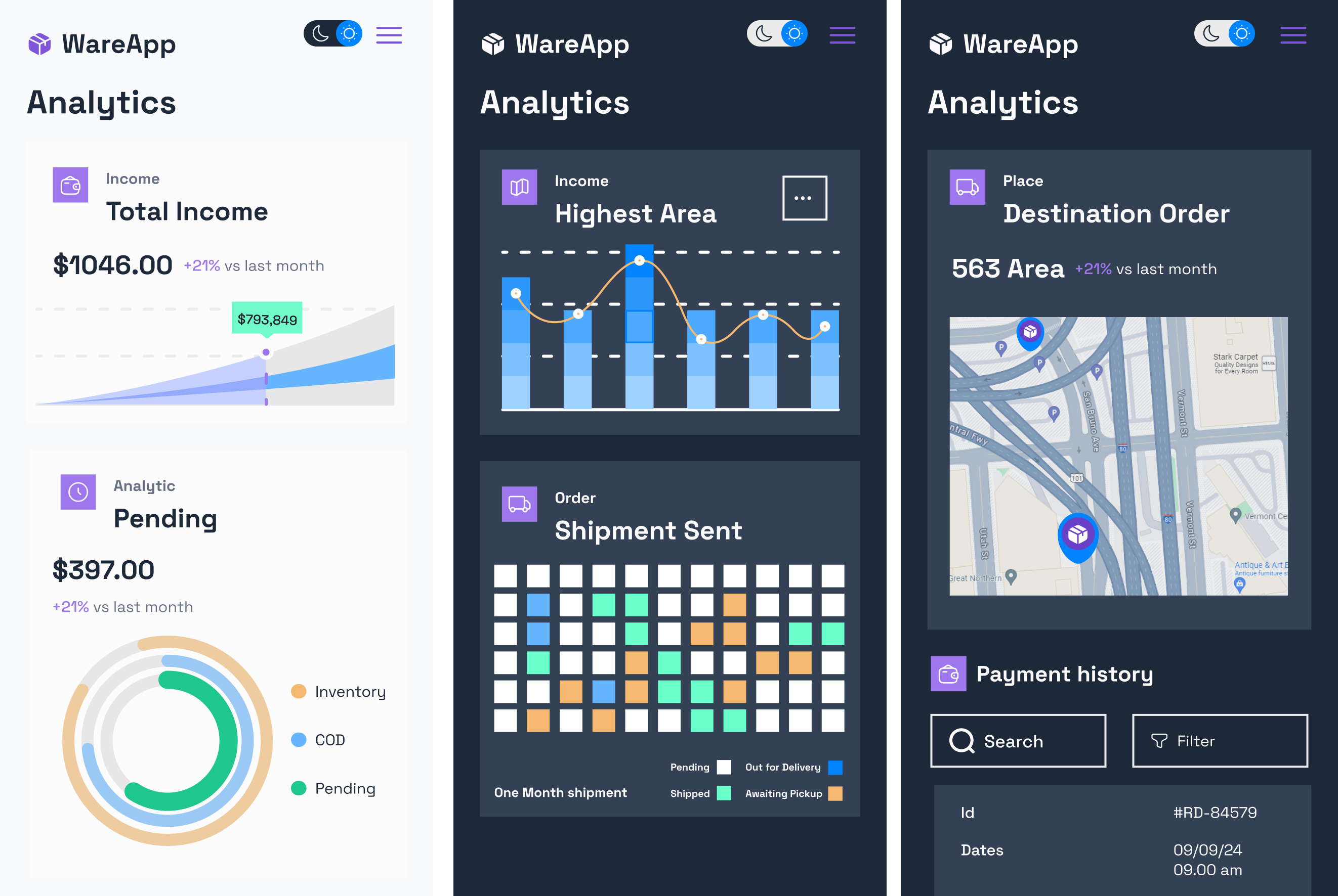
Warehouse Management with real-time tracking, detailed analytics, secure payments, and inventory management. The intuitive UI ensures high contrast and legibility, making the app accessible and user-friendly for efficient delivery operations.
Lack of Real-Time Visibility
Integration Issues
Inefficient Communication
We are creating an innovative SaaS product, WareSync, designed to revolutionize warehouse management. WareSync addresses the critical challenges faced by modern warehouses through a comprehensive suite of features that optimize operations, enhance visibility, and improve overall efficiency. Our solution provides real-time inventory visibility across all warehouse locations and sales channels via an intuitive dashboard and interactive map. By automating key processes such as inbound tracking, fulfillment, and dispatch, WareSync streamlines operations and minimizes errors.
Click the Miro Link - https://miro.com/app/board/uXjVK74-l_g=/?share_link_id=563554338953
1.Key Metrics and Quick Analysis - Four icon cards display key metrics like shipment status, delivery times, and performance trends with icons and numbers for quick analysis.
2.Shipment Overall Analysis - Data Plot Section: A comprehensive data plot area where users can view statistics by year, six months, one month, or weekly patterns. This section aims to facilitate quick decision-making based on visual data trends.
3.Courier Tracking and Delivery Details - Maps and Current Situations: An interactive map section that illustrates how to trace a courier using maps, providing real-time updates on the current location and status of shipments.
When designing courier delivery mobile app UI, I made accessibility a top priority. Ensuring usability for everyone, including those with visual impairments, reflects our commitment to an inclusive experience.
Color Contrast: A Design for All Eyes
The header uses a dark background (#1D2939), creating a strong contrast with the white text and icons. This makes it easier for users to interact with the navigation elements, even in low-light conditions or for those with color blindness.
Font Size and Legibility: Reading Made Easy
Similarly, in the main content area, the high contrast ratio ensures that text and icons stand out sharply against the background, making information easily readable and actions clearly distinguishable.
Effective Use of Color
Real-Time Status Indicators : Provides immediate feedback to users, keeping them informed about the status of their deliveries, which enhances user satisfaction and trust in the app.
User-Friendly Navigation
Facilitates easy and intuitive navigation, allowing users to find and access different sections of the app effortlessly.
Feedback and Notifications
Keeps users engaged and informed, ensuring they are aware of any updates or changes in their delivery status, which improves user engagement and satisfaction.
My design philosophy prioritizes accessibility, usability, and visual appeal, offering both light and dark modes to suit user preferences and environments. This dual-mode approach enhances comfort and demonstrates our commitment to inclusivity and adaptability.
Visual Comfort and Accessibility
Reduces eye strain in bright conditions and is generally familiar to users, making it easy to read and interact with.
Battery Efficiency
Dark mode enhances battery life, making it a more power-efficient choice for mobile devices.
Consistent Layout
Enhances user familiarity and ease of use, as users can easily predict where to find specific elements.
Adaptive Design
Ensures a consistent and optimal user experience regardless of the device being used.
Visual Hierarchy
Key information such as rider details, estimated arrival time, and addresses are prominently displayed using larger fonts and highlighted sections.
1. Real-Time Visibility and Tracking
Goal: Enhance real-time tracking information to improve decision-making and visibility across channels.
Metric: Real-time Data Accuracy
KPI: Percentage of accurate real-time data updates.
Metric: Decision-Making Speed
KPI: Average time taken to make decisions based on real-time data.
2. Integration with Other Systems
Goal: Seamlessly integrate shipment tracking with WMS, TMS, and ERP systems.
Metric: Integration Success Rate
KPI: Percentage of successful integrations with external systems.
Metric: Data Synchronization Accuracy
KPI: Consistency and accuracy of data across integrated systems.
3. Automation and Efficiency
Goal: Automate key processes to reduce manual efforts and errors.
Metric: Process Automation Rate
KPI: Percentage of processes automated (inbound tracking, fulfillment, dispatch).
Metric: Error Reduction
KPI: Number of errors in manual processes before and after automation.
4. User Engagement and Retention
Goal: Enhance user engagement and retention through responsive design and effective notifications.
Metric: User Engagement Rate
KPI: Number of active users interacting with real-time status indicators and notifications.
Metric: Retention Rate
KPI: Percentage of users retained over a specific period.
5. Accessibility and Usability
Goal: Ensure high contrast, legibility, and user-friendly navigation to make the app accessible for all users.
Metric: Accessibility Compliance
KPI: Compliance with accessibility standards (e.g., WCAG 2.1).
Metric: User Satisfaction
KPI: User satisfaction score (measured through surveys and feedback).
6. Visual Comfort and Efficiency
Goal: Provide both light and dark modes to enhance visual comfort and device efficiency.
Metric: User Preference Adoption
KPI: Percentage of users adopting light mode vs. dark mode.
Metric: Battery Efficiency
KPI: Battery usage metrics for the app in dark mode vs. light mode.