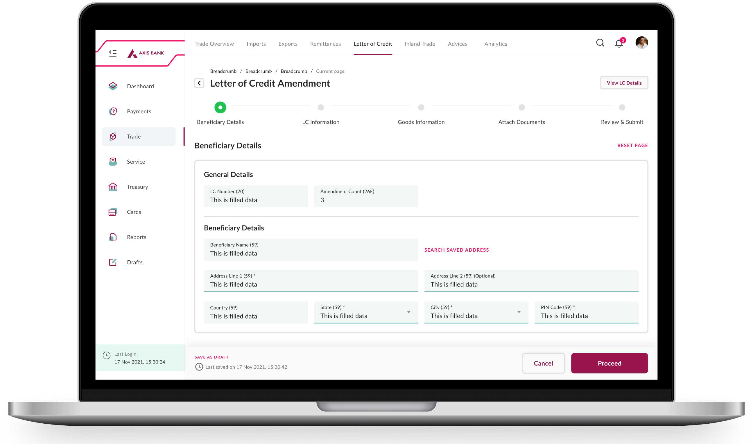
Personal Banking Experience
My primary focus is on applying user-centric design principles to enhance the usability and functionality of a personal banking desktop application.
My primary focus is on applying user-centric design principles to enhance the usability and functionality of a personal banking desktop application.
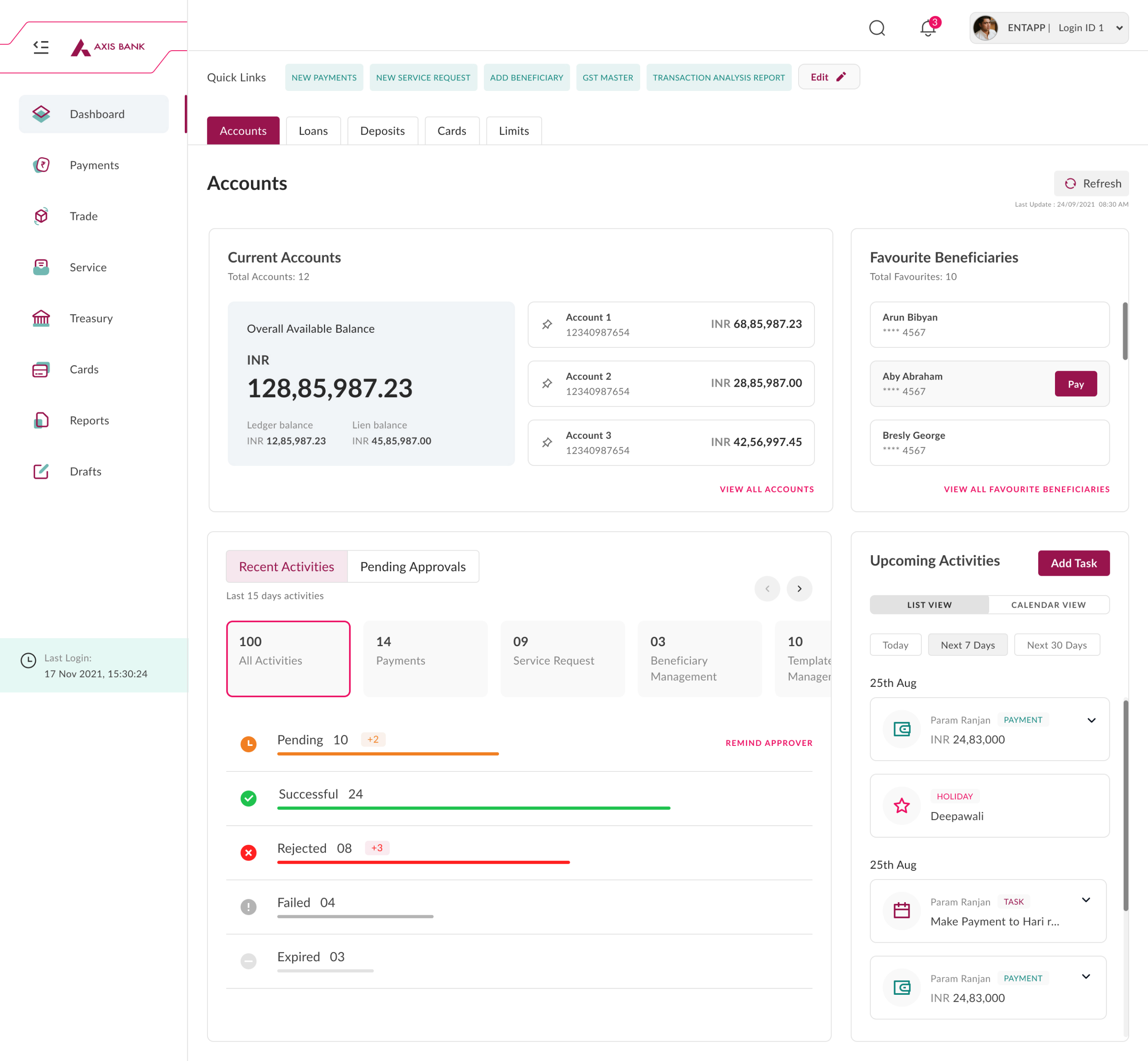
The wireframe's original simplicity gave way to a deeper design as it was informed by user feedback and refined through iteration. This trip shows how wireframes can transform a plan into a visually appealing dashboard.
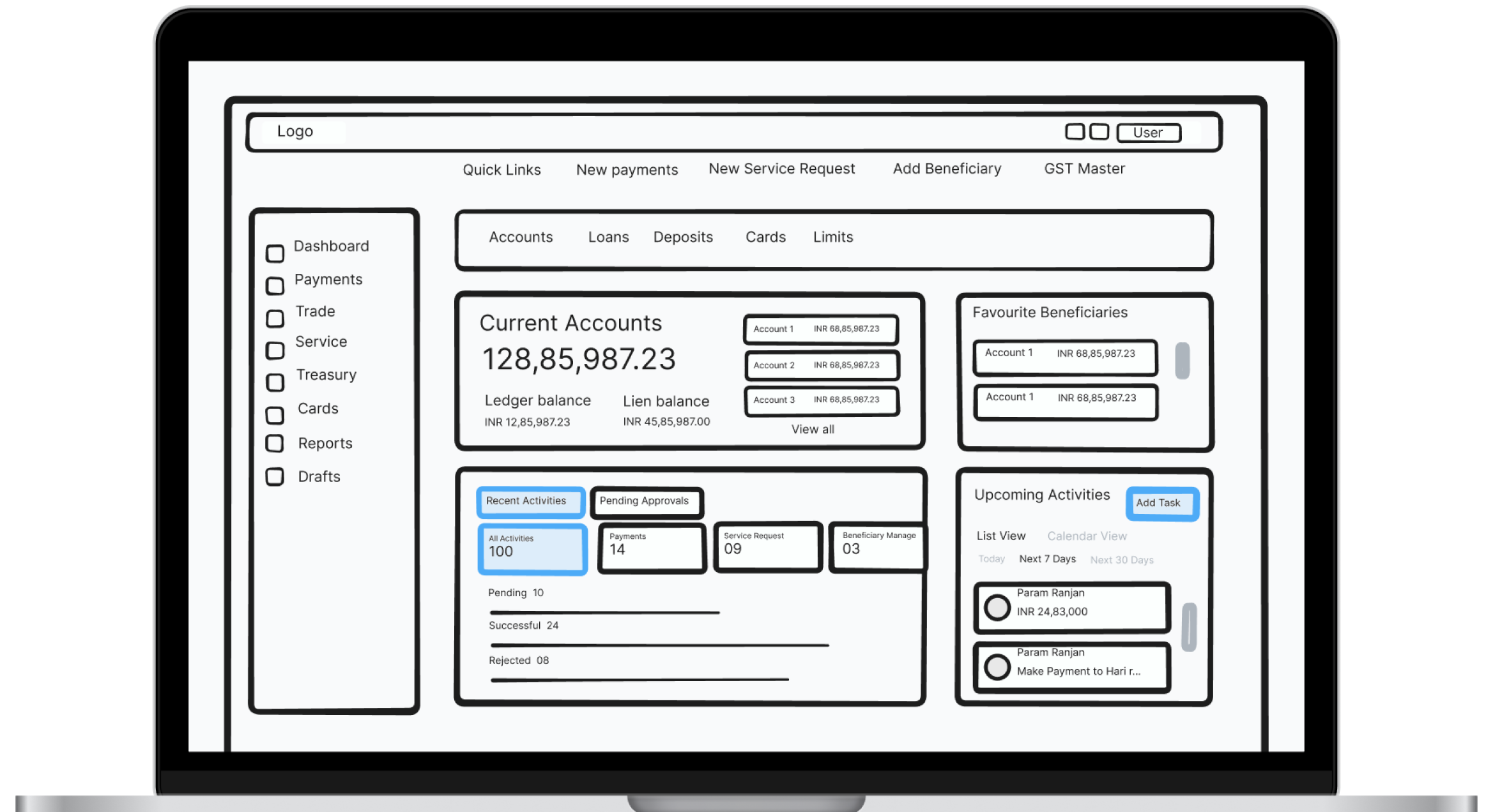
Low Fidelity Wireframe
Dashbaord
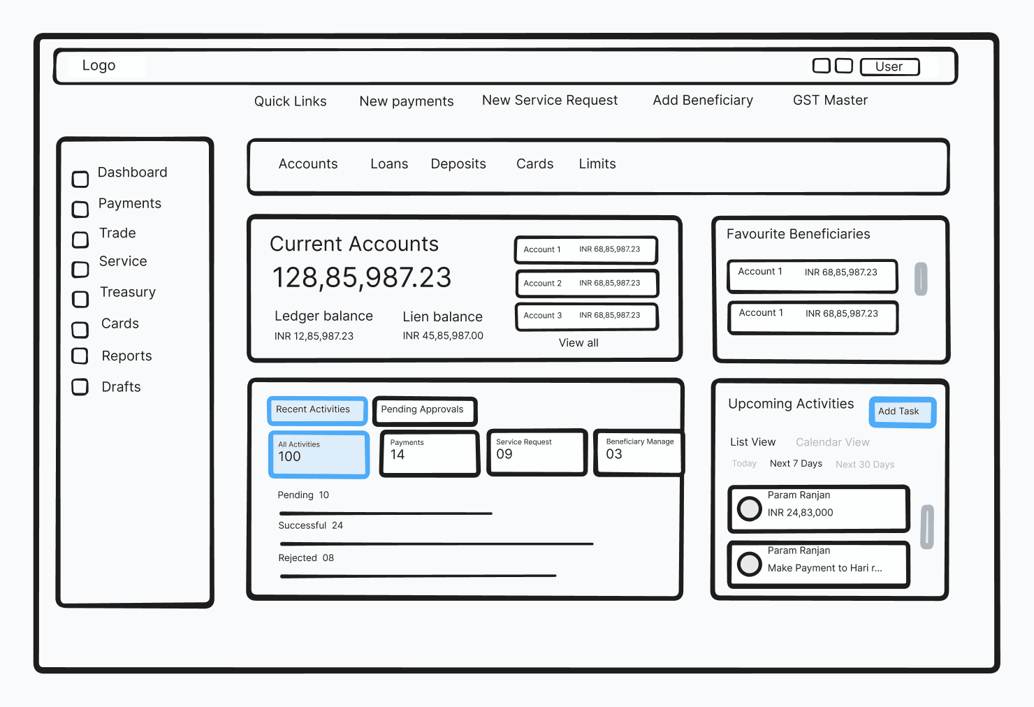
High Fidelity Wireframe
Dashbaord
High Fidelity Wireframe
It states that for any system, there’s a certain complexity that can not be reduced to the maximum.
The time it takes to make a decision increase with the number and complexity of choices.
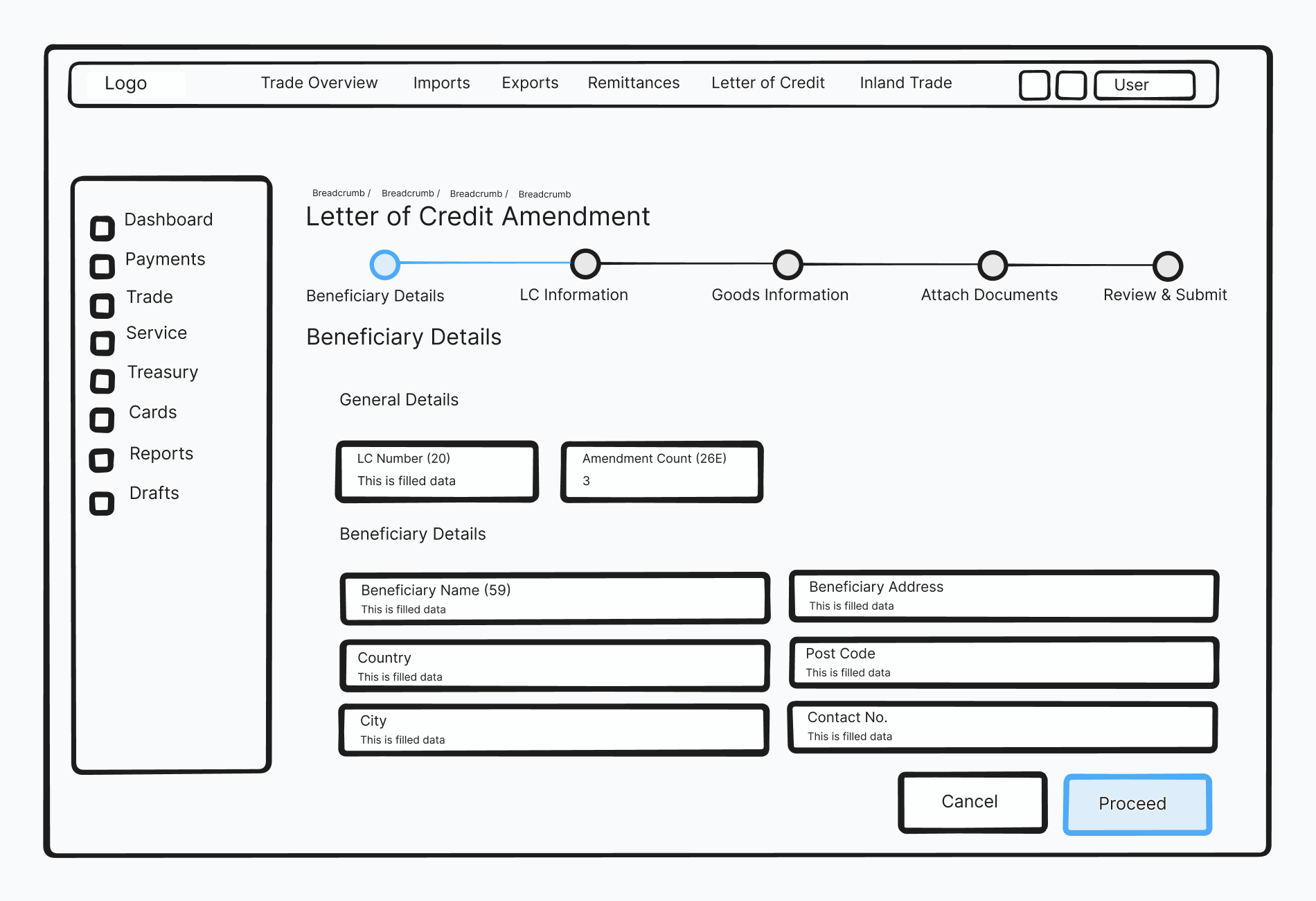
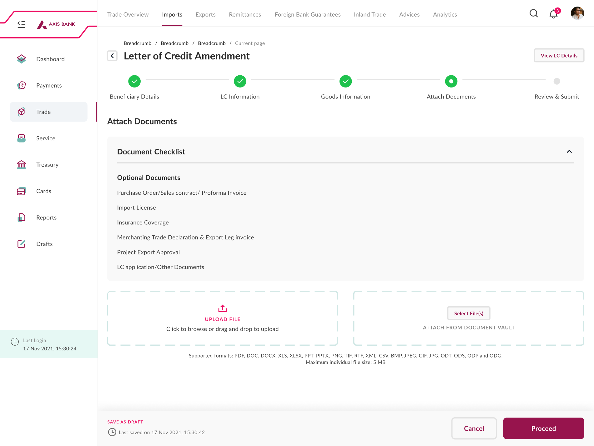
In a scenario where there is higher decision-making sections, we have separated the elements into steps and have asked the user to complete the flow in a step-by-step process.
The time required to rapidly move to a target area is a function of the ratio between the distance to the target and the width of the target.
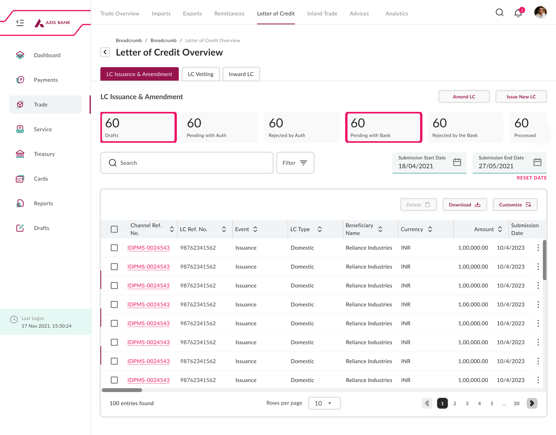
If the action items are small and grouped it is very difficult for a user to the target area to take an action
To reduce users effort, we have replaced icons with buttons so that it’s easier for the user to reach the target area and take an action.
Saves Space: It keeps your screen looking neat and tidy by hiding stuff you don't need all the time.
Always in One Place: You can always find the menu on the side, so it's easy to use.
You're in Control: You decide when to open it, so you're the boss.
Works on All Screens: No matter if you have a big screen or a small one, it still works fine.
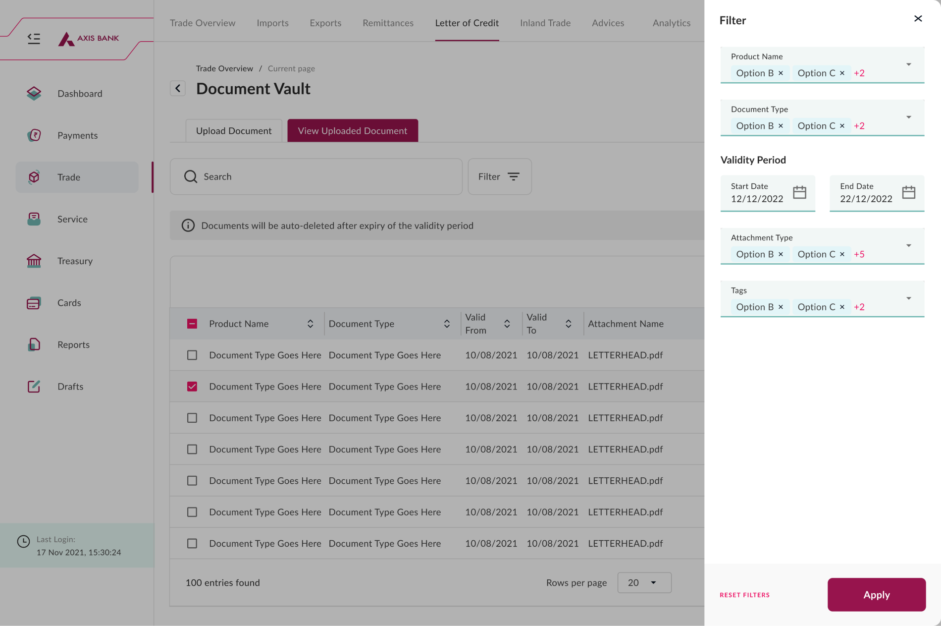
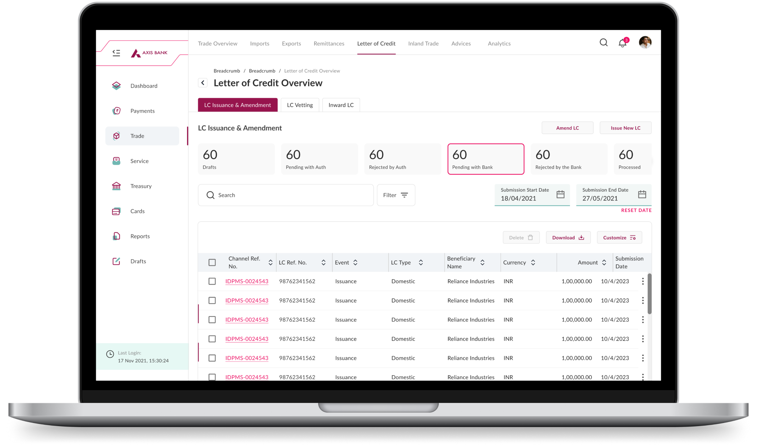
This design adopts a minimalist style. L1 and L2 navigation are distinguished from one another, and L2 navigation is clearly called out, which speeds up navigation. A search and filter option was added to the table to help users get rid of unwanted data when they need to.